You could hear the energy and optimism in their message, but they were working with a craft-fair logo and an unhinged colour palette.
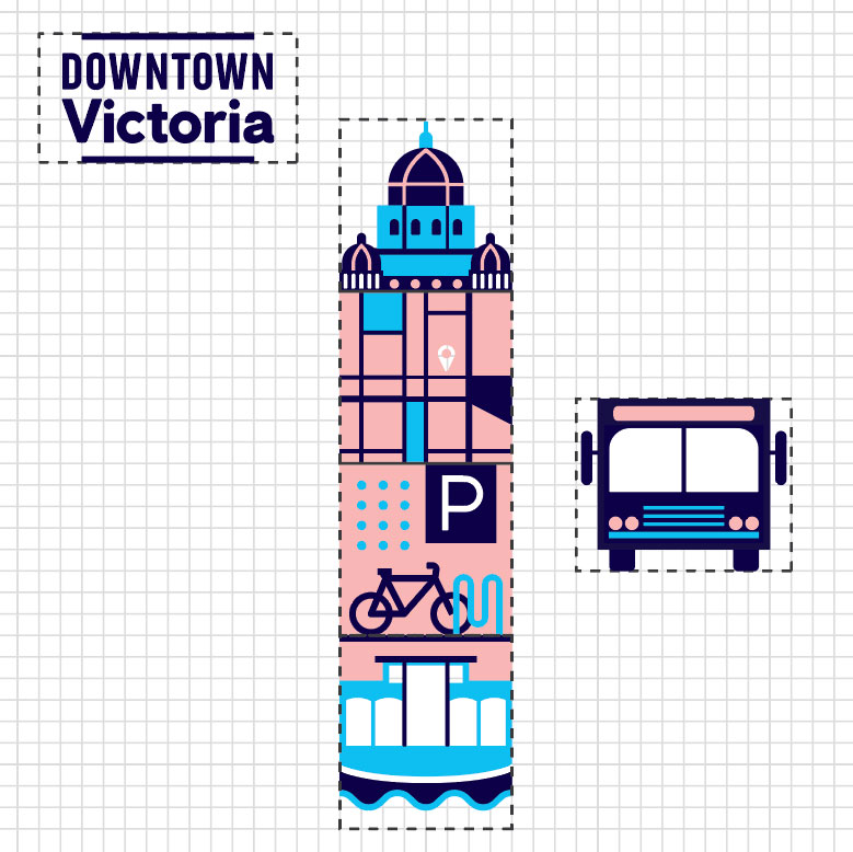
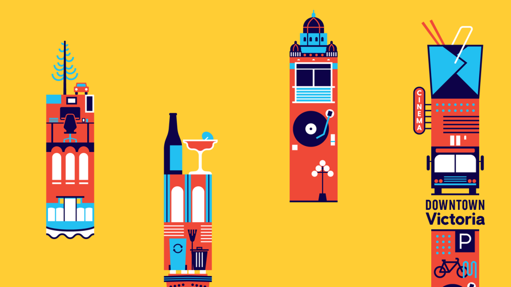
We worked with their team to rebuild their brand as the shared voice of a community. It begins with a new colour palette—bright and energetic, without using every crayon in the box. A contemporary hierarchy of fonts gives their words the authority they deserve. And to reflect the something-for-everyone nature of a healthy downtown, we developed an interlocking system of iconography/badges that form cities to suit every need. The refreshed Downtown Victoria stands as a city working for everyone, planning for the future, and rising to any challenge.


